


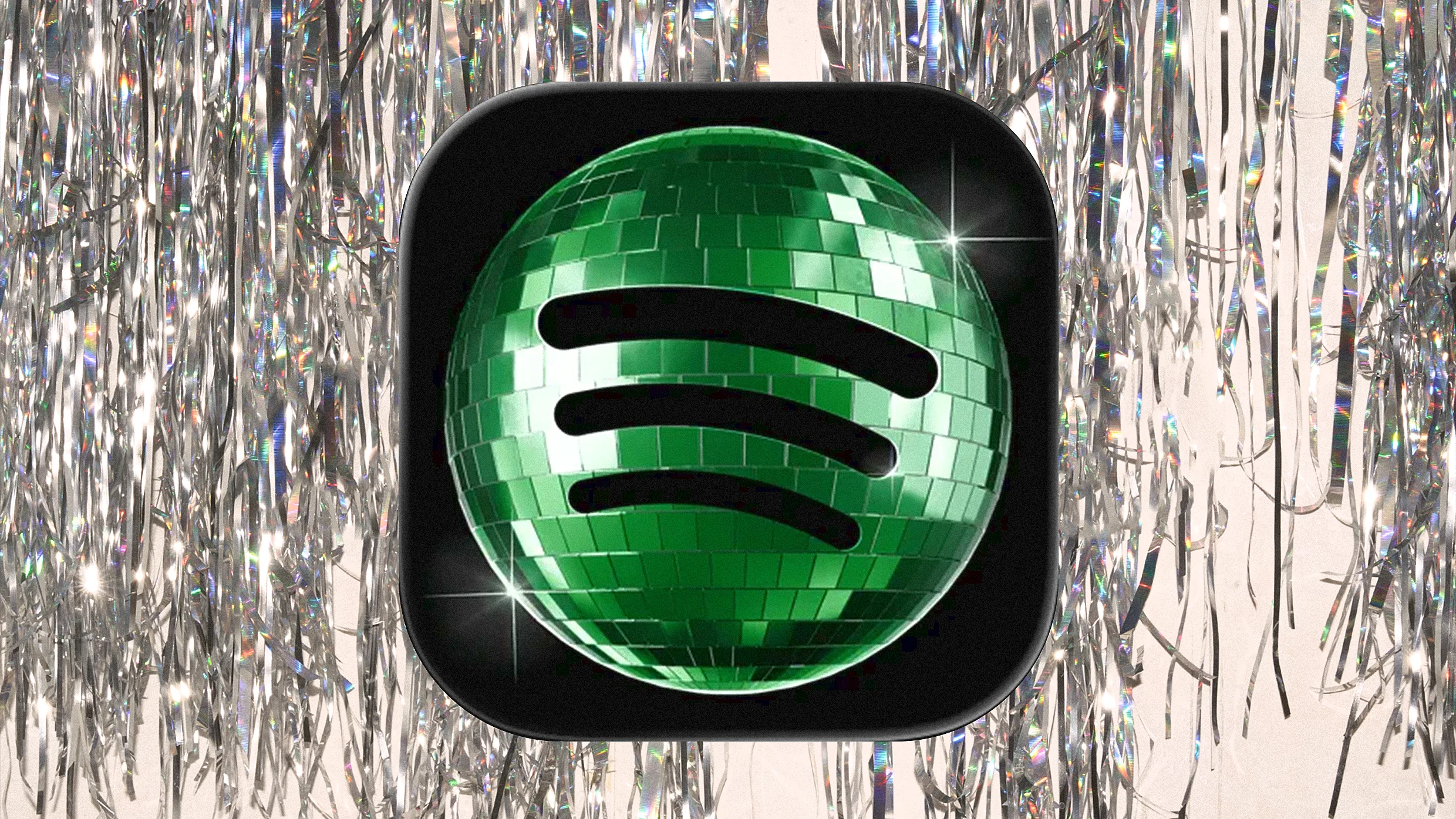

Spotify’s disco ball logo divided the internet. Part anniversary stunt, part design experiment, the temporary rebrand sparked backlash, memes and debate about whether it was a marketing win or fail. We delved deeper
When Spotify swapped its familiar green app icon for a shiny disco ball earlier this month, users immediately thought something was wrong with their phones.
It wasn’t. The change was part of the streaming giant’s 20th anniversary campaign: Spotify 20: Your Party of the Year(s). A limited-edition redesign celebrating two decades of music culture. Spotify later confirmed the logo was temporary, after confusion and backlash spread fast online.
The new icon leaned hard into disco aesthetics, Y2K nostalgia and early-2000s visual culture. Lauren Solomon, Spotify’s Senior Director of Global Brand, described the redesign as a temporary expression of culture tied to milestone celebrations. The disco ball, it seems, was always meant to be just a moment and not a full makeover.
But the internet had already made up its mind.
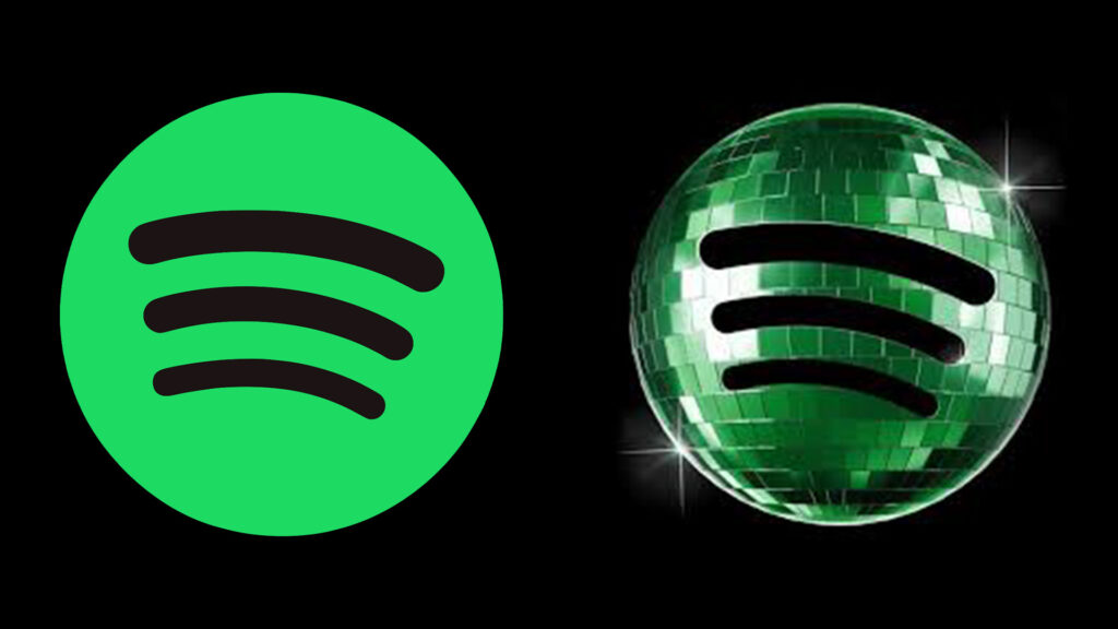
“That Baby is Ugly”
On Reddit, reactions were swift and unforgiving. Users compared the icon to a loading error, a blurry app download and an unfinished render. “It looks like it’s updating constantly,” wrote one user. Another kept it simple: “That baby is ugly.”
Designers piled on too, pointing out that the reflective detailing turned muddy and illegible at app icon size, which was a fairly fundamental brief to get wrong.
Spotify, to its credit, didn’t panic. The brand responded with: “We know glitter is not for everyone. Our temp glow up ends soon. Your regularly scheduled Spotify icon returns next week.” Witty, self-aware, and, as it turned out, strategically smart (and in control).
The Bigger Picture: Is Minimalism Over?
Not everyone hated it. Some praised Spotify for breaking from the flat, minimalist branding that has come to define and arguably homogenise the tech industry. The disco ball divided opinion partly because it arrived at a moment when that broader conversation was already well underway.
The Y2K revival has pushed brands into an era of bold, playful, nostalgic design: chrome lettering, bubble fonts, metallic sheens, bright neons and holographic treatments increasingly visible across logos and packaging. Brands like Airbnb and Duolingo have already leaned into this shift.
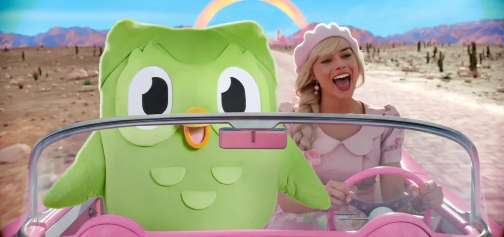
Design forecasters have noted growing fatigue with generic minimalism, pointing to a shift towards identities that feel personal, tactile and clearly owned by someone. Spotify’s disco ball, clumsy execution aside, was very much part of this trend.
The episode also sparked something unexpected: other brands and platforms joined in, posting their own AI generated, disco ball-inspired logo versions, turning the backlash into something closer to a viral design movement. The trend even got a name: discomorphism.
Win or Fail?
On the design end, the verdict was mixed, but we wouldn’t be wrong to call it a fail. On the marketing front, though, the picture looks very different.
But what do South Africans think?
Jarred Cinman, CEO of VML South Africa, sees the move clearly for what it was: “It seems clear that this was a humorous and disruptive decision on Spotify’s part to mark their 20th anniversary. Surely the good folk in their marketing team realised that this would reflect hilariously on them — it is a mirror ball after all — and I’m sure the extra publicity has been a net positive regardless of the sentiment.”
For Cinman, the broader point is simple: “These days marketing is all about breaking through the clutter, and this absurd stunt has self-evidently done that. After 20 years and becoming a cultural icon, they’ve earned the right to make a bit of fun of themselves.”
Within days, the logo had become meme fodder, sparked thought pieces from design publications and dominated online conversation well beyond the music world. The kind of attention that would normally cost Spotify millions.
Sometimes that is exactly the strategy. Even bad reactions mean people are paying attention.